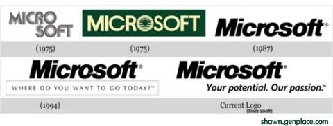
Microsoft, even as i type this word, i feel the presence of the company as i see my OS. It is finest among the companies in many aspects including CSR. But, then i am made to say that their logos could have been far better and were less aesthetic than the Apple Logos.

Basically, Microsoft Logo has no much change since 1987 . The only main different would be in 1975 with green color in-box as well as the separation words of Mirco and soft

No comments:
Post a Comment